High-stress environments require empathy in design. For first-time visitors of a big hospital or government building, confusion adds to an already stressful situation. Missed signs turn what should be a quick visit into an overwhelming experience.
Good wayfinding lowers anxiety. It helps people find the right door and the right person without asking three times along the way. Design systems built around these needs earn trust quickly.
Focus on Movement First, Design Second
Before any signage goes up, the traffic flow must be clear. Mapping a visitor’s most likely route reveals the key decision points. EWell-designed navigation flattens the learning curve of a facility within the first few steps.
What happens at the entry? Can guests immediately tell where to go next? Can they self-correct after a missed turn without backtracking to the front? Each step forward should answer the last question before it’s even asked.
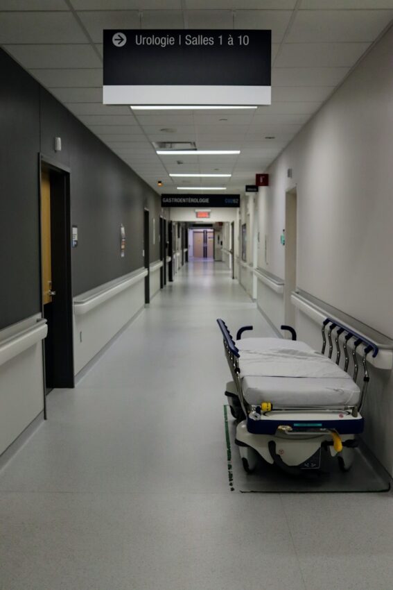
In clinics and hospitals, time-sensitive visits are common. A patient late for imaging shouldn’t have to loop through an unrelated department. This is where good wayfinding for medical facilities starts: understanding the space through the lens of someone who’s anxious, tired, or distracted.
Use Language That Works at Eye Level
Direction doesn’t always need decoration. A sign works best when the reader sees it quickly and processes it faster. Fonts should be legible from a distance. For text, avoid branding colors that camouflages into wall finishes. The visual message should be clear even without context.
For first-time guests, vague labels like “consultation zone” or “office wing A” feel abstract.
Descriptors like “Billing,” “X-Ray Check-In,” or “Family Waiting Area” make better anchors. Even short phrases like “Next Elevator to 5th Floor Clinics” prevent confusion when stress levels are already elevated.
Anchor the Visitor’s Memory
Wayfinding should rely on visual anchors. These allow people to form mental maps on the fly. Simple color zones and icon systems work best. Color-coded departments paired with distinct symbols reduce language barriers and help orient guests from any entrance.
Tying these colors and symbols across maps, door signs, and overhead markers builds muscle memory. Even if the visitor enters through the wrong door, the system still gets them where they need to be.
Reduce Options, Not Flexibility
In stressful spaces, too many choices feel like pressure. At decision points, three arrows pointing in different directions with similar names only raise the odds of a wrong turn. Instead, flatten the information. Show the one next move and where it leads.
Layered signage works well here. Instead of listing every department in the lobby, direct people to zones. Each subsequent sign then guides them deeper without listing everything again.
Good signage simplifies the steps without boxing in the guest. If someone realizes mid-route that they need a different department, the signage should offer options without making them start over.
The Best Systems Handle Interruptions
Even in perfect buildings, unexpected stress shows up. Visitors may stop mid-route, pull out their phones, or need a break. A smart design anticipates this by:
- Adding reassurance signs at regular intervals (“You’re still on the right path”)
- Repeating symbols or colors so visitors know they haven’t gone off-course
- Keeping key destinations listed on secondary signs, just in case someone joins mid-way
- Providing maps at hubs and intersections rather than just at entrances
- Making it easy to re-orient after an interruption
Don’t Let Style Compete With Function
Sleek signs with custom icons or minimal text may look polished in renderings. But if they leave people guessing, the design fails.
Materials matter, too. In high-stress environments, surfaces need to resist glare and avoid visual noise. Glossy backgrounds may look modern, but they reflect overhead lights and become unreadable at angles. Sandblasted glass, matte metals, or powder-coated finishes read better and stay clean.
Brand guidelines should support clarity. Logos belong in headers instead of hiding as watermarks behind text. Visual hierarchy wins over decorative consistency.
Navigation is most powerful when it fades into the background. Guests should arrive at their destination feeling guided, not managed. In high-stress environments, simplicity earns more gratitude than flash ever could. The best systems support people in motion and reduce cognitive strain one turn at a time.