
Most people shopping for outdoor lighting spend all their time comparing fixtures, bronze versus black, this brand versus that one, and never once think about color. That’s backward. The color temperature of your bulbs shapes how a property feels at night far more than the fixture materials.
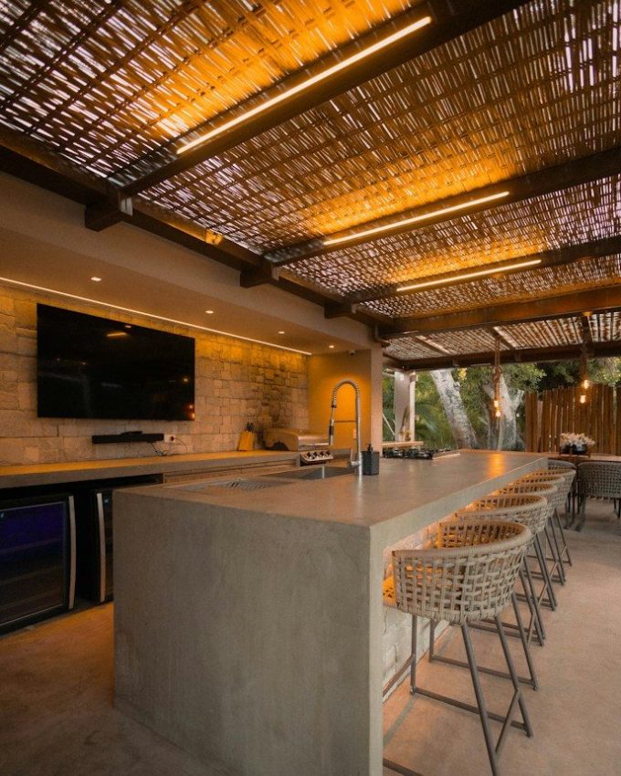
Get the lighting color wrong, and a beautifully landscaped yard reads like a gas station. Get it right, and the same yard looks like it belongs in a boutique hotel brochure.
The tricky part is that color isn’t a single decision. It changes depending on what a fixture is actually lighting: a patio, a walkway, a tree line, a gate. Treating the whole property as one lighting problem is usually where things go wrong first. Before you order anything, it’s worth understanding what “color” actually means here, and where each option earns its keep.
Kelvin Is the Number That Actually Matters
Every outdoor bulb has a color temperature, measured in kelvins, and it’s the single spec that determines whether your lighting feels warm or cold. Lower numbers mean warmer, yellower light. Higher numbers mean cooler, bluer light. It sounds backward until you remember it’s describing the temperature of a heated object, not a thermostat setting for comfort.
For outdoor residential use, you’re really choosing between three bands:
- 2700K-3000K (warm white, the closest thing to old-school incandescent)
- 3500K-4000K (neutral white, crisp but not clinical)
- 5000K and up (cool white, the bluish light you associate with parking garages and hospital corridors)
None of these is objectively “better.” They’re tools for different jobs.
There’s a psychological piece to this too. Warm light reads as domestic; it’s the color of candlelight, fireplaces, and lamplight, so it puts people at ease without anyone consciously registering why. Cool light reads as institutional or industrial, because that’s mostly where we encounter it: garages, warehouses, office parking lots.
Neither association is right or wrong, but it explains why a driveway lit in 2700K can feel oddly soft for what’s supposed to be a security zone, and why a patio lit in 5000K can feel a little like sitting in a break room.
Match the Color to the Job, Not Just the Mood
Patios, Decks, and Anywhere You Actually Sit
Warm light (2700K-3000K) is almost always the right call for spaces where people gather. It’s flattering to skin tone, it makes wood and brick look richer instead of washed out, and it signals “relax” the same way a dimmed dining room does.
This is where most homeowners over-light without realizing it: you don’t need patio lighting bright enough to read by, just bright enough to see your drink.
Paths, Steps, and Anywhere You Walk
Warm white still works well for walkways and stairs. If your patio lighting sits closer to 2700K, using 3000K along paths can give you a little more edge definition without creating an obvious shift in color across the property.
Driveways, Gates, and Security Zones
For areas where the priority is visibility rather than ambiance, 4000K is a practical cooler option. It also works well if you plan to use cooler light for moonlighting elsewhere on the property, helping you keep the overall palette consistent.
Security cameras also tend to pick up more usable detail under brighter, higher-CRI light, which is worth knowing if cameras are part of your setup. You’re trading some coziness for clarity here, and that’s the right trade for a driveway.
Uplighting, Moonlighting, and General Garden Spaces
This is where things can get a bit complicated, as each lighting type performs better with a different lighting color. For example, moonlighting, which usually shines down from trees to mimic the moon, performs best with cool white (4000K).
However, uplighting and accent lighting for garden spaces tend to work best with warm light (2700K-3000K). This is because it creates a natural golden-hour radiance, creating an inviting outdoor space.
So lighting your garden space is far more complicated than your patio or driveway, and it really depends on the atmosphere you want to create.
Lastly, while you can use colored lights, these tend to take away from the natural beauty of your garden space. Reds, greens, and violets cast an unnatural glow on everything, which can do the opposite of what you intend. While colored lights can work, they need to be used sparingly, and more as accent lighting than anything else.
A Couple of Color Theory Basics Nobody Mentions
Color Rendering Index (CRI) gets left out of most homeowner conversations, but it matters almost as much as kelvins. A low-CRI bulb can technically be the “right” temperature and still make your landscaping look dull or slightly wrong; greens go muddy, reds go flat. Anywhere you’re lighting plants, brick, or anything you want to look true to its actual color, look for CRI 90 or above.
The other thing worth knowing: mixing too many color temperatures across one property almost never looks intentional. It looks like the lighting was installed in phases by three different people. Pick one warm temperature for living and social spaces, one cooler temperature for security and utility zones, and stop there.
Where Hiring Professionals Is the Smart Choice
This is also where a lot of DIY installs go sideways. It’s not because homeowners pick a bad color, but because getting consistent color across a dozen fixtures from different manufacturers, positioned at different distances and angles, is genuinely fiddly work. Add in layering, transformer load limits, and glare angles that only become obvious once the sun goes down, and it stops being a weekend project pretty fast.
This is why homeowners who want it done right the first time often bring in a pro. In and around Tennessee, for instance, where wooded lots and hilly terrain make glare and shadow harder to predict, many homeowners call in outdoor lighting experts in Knoxville rather than tackling it themselves. A trained eye catches the mismatch, the hot spots, and the glare into a neighbor’s window before it’s wired in, not after.
A Few Practical Tips Before You Buy
- Stick to one warm range and one cooler range across the property rather than mixing several noticeably different color temperatures.
- Test bulbs in place at dusk before committing to a full order; color reads differently in daylight than after dark.
- Choose dimmable fixtures where you can; the right color at the wrong intensity still looks off.
- Prioritize CRI 90+ anywhere plants, stone, or brick are part of the display.
- Remember that cooler light reads brighter than it measures in lumens, so you can often use less of it than you’d expect.
- Walk the property after dark before finalizing placement. A fixture that looks fine on a spec sheet can throw glare or shadows you’d never predict from a daytime walkthrough.
Conclusion
None of this is complicated once you know what to look for, but it’s easy to get backward if color is the last thing you think about instead of the first. Pick your Kelvin range based on what a space is actually for, keep your palette simple, and resist the urge to light everything the same way just because it’s easier to order in bulk. The fixtures will do their job a lot better than they would otherwise, and your property will look like it was lit on purpose long after the lights come on.